Creative Website Design: The Complete Guide to Building a Website People Actually Remember
What creative website design really is, when it's worth it, what it costs, and how to build one that stays fast and SEO-friendly.

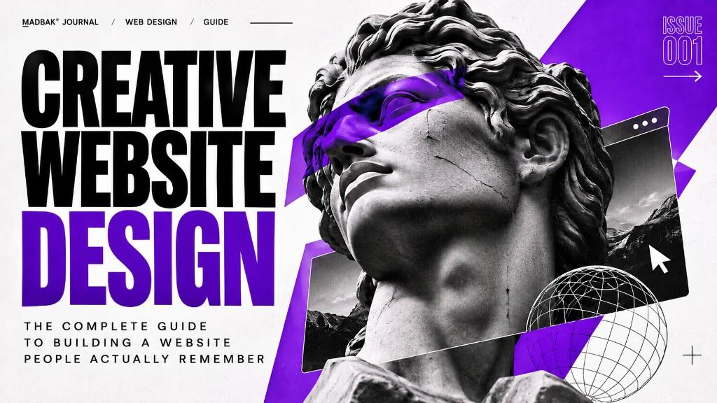
A creative website is not a website with "more animation." It's a site where art direction, motion, interaction and content are designed together around one idea — so visitors understand your brand faster and remember it longer. Done well, it is still fast, readable by Google and AI search, and accessible. Done badly, it's a slow, pretty puzzle nobody finishes. This guide shows you the difference, what it costs, and how to decide whether you need one at all.
Most websites today look like they came out of the same box. Same hero, same three feature cards, same stock gradient. That's not a crime — templates exist for good reasons. But if your brand lives on attention (a launch, a creative studio, a fashion label, a Web3 project, a personal brand), looking like everyone else is expensive. People don't scroll past what they can't forget.
I build websites, digital products and interactive experiences with a point of view. Below is everything I'd tell a client before we start — including when not to hire someone like me.
What is creative website design?
Creative website design is an approach where the visual direction, motion and interaction are part of the message, not decoration added at the end.
A standard website answers: "What do you do?" A creative website answers that too — and also: "How should this feel?"
In practice that means:
- Art direction — a clear visual concept (typography, colour, composition, imagery) that belongs to your brand and couldn't be swapped onto a competitor.
- Motion with a job — animation that guides attention, explains a product or creates rhythm, instead of things flying in for no reason.
- Scroll storytelling — the page unfolds like a sequence, revealing your story in the order a visitor needs it.
- Micro-interactions — small responses to hover, click and scroll that make the interface feel alive and considered.
- Custom UI — layouts and components built for your content, not your content squeezed into a theme.
- Optional depth — 3D, WebGL or shader effects where they serve the idea.
Creative vs. template website
| Template / theme site | Creative website | |
|---|---|---|
| Starting point | A layout that exists already | Your brand, audience and goal |
| Visual identity | Shared with thousands of sites | Built around one concept |
| Motion | Default fade-ins (or none) | Choreographed, purposeful |
| Content | Fitted into fixed blocks | Structure designed around it |
| Best at | Speed to launch, low budget | Attention, memorability, positioning |
| Risk | Looks generic | Can get slow or confusing if built carelessly |
That last row matters. The craft isn't in adding effects — it's in adding them without paying for them in speed, clarity or search visibility.
Do you actually need a creative website? (An honest checklist)
You probably do if:
- Your audience judges you on taste — creative studios, fashion, art, luxury, agencies, designers.
- You're launching something and need a moment: a product drop, an event, a token, a campaign.
- You compete in a crowded market where every competitor's site looks the same (hello, crypto and fintech).
- You're a person, not just a company — a personal brand site is where your point of view either shows or disappears.
- You need to explain something complex (a platform, an infrastructure product) and words alone aren't doing it.
You probably don't (yet) if:
- You need a site live this week with minimal budget.
- Your buyers only want a price list and a phone number.
- You don't have your positioning or content figured out. Motion can't fix an unclear message — it amplifies whatever message is there.
If you're in the second group, a clean, fast, well-structured site is the right move. You can add the cinematic layer later, once there's a story worth staging.
The building blocks of a creative website
Art direction
Everything starts here. Before a single line of code, I want to know what the site should feel like — calm and tactile? Loud and editorial? Quiet and museum-like? That decision drives typography, spacing, colour, image treatment and how things move. For example, the MUSE / 24 art-gallery site I built uses quiet typography and a "living archive" structure, because a gallery should let the work breathe. A Web3 growth platform needs a very different energy.
Motion design
Good web motion has three jobs:
- Direct attention — tell the eye where to go next.
- Explain — show how a product, process or system works.
- Create rhythm — give the page pacing, so scrolling feels like reading a story, not wading through a wall.
If an animation does none of those, it's a candidate for deletion.
Scroll storytelling
Instead of a stack of unrelated sections, the page is written like a sequence: hook → context → proof → detail → action. Scroll-linked animation then reveals each beat at the right moment. This is especially powerful for launches, events and premium brands — the formats I design my Creative / Cinematic package around.
Micro-interactions
Buttons that respond, cursors that react, cards that tilt slightly, menus that open with intent. Individually small; together they signal "someone cared about this."
3D and WebGL (when appropriate)
Three.js, shaders and WebGL can create depth no static layout can. They're also the fastest way to make a site heavy. I use them when they carry the concept — a product you can rotate, an atmosphere that is the brand — and skip them when a well-designed 2D layout says it better.
Typography and layout systems
The least flashy part and often the most important. A strong type scale and grid make a site look intentional even with zero animation. Motion sits on top of a solid system — never in place of one.
Website design styles: the main creative directions explained
"Creative" isn't one look. It's a family of design directions, each with its own mood, strengths and trade-offs. Knowing them helps you brief a designer clearly — instead of "make it cool," you can say "editorial, quiet, with cinematic scroll moments." Here are the styles I get asked about most, what they feel like, and who they suit.
Minimalist & Swiss (grid-based) design
Clean grids, generous white space, strict typography and very few colours. Everything has a reason to be there.
Editorial / magazine design
Large headlines, expressive type pairings, asymmetric layouts and image-led storytelling — borrowed from print magazines.
Brutalist & neo-brutalist design
Raw, honest, deliberately "unpolished": thick borders, hard shadows, system fonts, clashing blocks of colour. Neo-brutalism softens it with friendlier colours and rounded energy.
Maximalist & bold-colour design
More is more: saturated colour, layered imagery, big patterns, loud type, lots happening at once — but orchestrated.
Cinematic & scroll-storytelling design
The page behaves like a film: scenes, pacing, transitions and reveals tied to the scroll. Often full-screen visuals and pinned sections.
3D, WebGL & immersive design
Real-time 3D scenes, interactive objects, shaders, particles and depth you can move through.
Kinetic typography (type-led design)
The type is the visual. Letters move, stretch, split, scroll and react — often with very few images.
Retro, Y2K, pixel & terminal-inspired design
Nostalgic interfaces: old operating systems, pixel art, CRT glow, terminal windows, chrome gradients. My own site leans into this — the "talk to the machine" section and system-boot labels are a playful nod to it.
Dark tech & futuristic design
Dark backgrounds, glowing accents, data-style visuals, grids and precise motion.
Glassmorphism & soft-gradient design
Frosted-glass panels, blur, light transparency and smooth gradient backgrounds.
Bento-grid design
Content arranged in a grid of tiles of different sizes — each tile a feature, stat, image or micro-animation.
Organic, tactile & natural design
Soft shapes, textures, paper and grain, earthy colours, hand-drawn details, gentle motion.
Illustration & character-led design
A custom illustration world or a recurring character becomes the face of the brand. This connects closely to my character-design and AI-persona work.
Luxury & quiet-elegance design
Restraint as a signal: refined serif type, slow transitions, high-end photography, lots of space and very little noise.
Experimental & interactive-playground design
The site is an experience to explore: unusual navigation, games, generative visuals, cursor-driven worlds.
Design styles at a glance
| Style | Mood | Best for | Build weight |
|---|---|---|---|
| Minimalist / Swiss | Calm, precise | SaaS, architecture, professional services | Light |
| Editorial | Cultured, story-led | Galleries, fashion, studios, events | Light–medium |
| Brutalist / neo-brutalist | Bold, raw | Agencies, indie products, music | Light |
| Maximalist | Loud, joyful | Fashion drops, entertainment, food brands | Medium |
| Cinematic scroll | Immersive, premium | Launches, luxury, hotels, real estate | Heavy |
| 3D / WebGL | Futuristic, tactile | Web3, tech, gaming, products | Heavy |
| Kinetic typography | Sharp, modern | Agencies, personal brands, campaigns | Medium |
| Retro / Y2K / terminal | Playful, nerdy | Personal brands, gaming, digital art | Light–medium |
| Dark tech | Powerful, technical | Web3, fintech, AI, dev tools | Medium |
| Glassmorphism | Light, app-like | SaaS, apps, fintech | Medium |
| Bento grid | Organised, scannable | SaaS, startups, portfolios | Light |
| Organic / tactile | Warm, human | Restaurants, wellness, hospitality | Light–medium |
| Illustration / character-led | Friendly, distinctive | Education, apps, communities, NFTs | Medium |
| Luxury / quiet elegance | Exclusive, timeless | Luxury, hotels, jewellery, fashion | Medium |
| Experimental playground | Surprising, artistic | Studios, art, campaign microsites | Heavy |
"Build weight" is a rough guide to how much design, animation and performance work a style usually needs — which is one of the biggest factors in price.
Can you mix styles?
Yes — most strong websites do. A common recipe is a calm base (minimalist or editorial) with one or two signature moments (a cinematic hero, a 3D object, a kinetic headline). The base keeps the site usable and fast; the signature moments make it memorable. The mistake is trying to use five styles at once.
Creative doesn't have to mean slow: performance, SEO and accessibility
This is where many "award-style" sites fail and where clients get burned. A beautiful site that loads slowly, can't be indexed or makes people dizzy is a liability. Here's how I keep the creative layer from costing you traffic.
Performance
Google's Core Web Vitals are a useful baseline. A "good" experience means roughly:
- LCP (Largest Contentful Paint) — main content visible within 2.5 seconds
- INP (Interaction to Next Paint) — the page responds to input within 200 ms
- CLS (Cumulative Layout Shift) — layout stays stable (score 0.1 or less)
To hit these on motion-heavy pages I typically: render content on the server with Next.js, lazy-load heavy assets and 3D scenes, animate GPU-friendly properties (transform, opacity) instead of layout, compress and size images properly, and load WebGL only when it's on screen.
SEO and AI search visibility
Search engines and AI assistants read text in HTML, not pixels in a canvas. So on every creative build:
- Real headings and copy live in the HTML — animation reveals content, it doesn't replace it.
- Each page has proper titles, meta descriptions, semantic structure and clean URLs.
- Pages are server-rendered or statically generated, so crawlers see the full content.
- Multilingual sites get correct language setup (including RTL for Persian and Arabic).
Accessibility
Motion can trigger discomfort for some people. Creative sites should respect the operating-system "reduce motion" setting (prefers-reduced-motion), keep text contrast readable, stay keyboard-navigable and never hide essential information behind an animation. A site that works for more people is simply a better site.
The tech stack behind my creative websites
I build on a modern frontend stack chosen for flexibility and speed:
| Tool | What it does for your site |
|---|---|
| Next.js | Fast, SEO-friendly React framework with server rendering — the foundation |
| TypeScript | Fewer bugs, easier to maintain and extend later |
| Tailwind CSS | Consistent design system in code, quick iteration |
| GSAP & Framer Motion | Smooth, precise animation and scroll-based storytelling |
| Three.js / WebGL / shaders | 3D and visual depth, used only where it earns its place |
| Vercel | Global deployment, fast hosting, easy previews |
Why not a page builder? Builders are great for simple sites. But for custom motion, unusual layouts or a site that needs to grow into a product, hand-built code gives you full control over both the experience and the performance. Curious what that looks like? I share experiments and free source code in MADLAB — take the code, make it yours.
Creative website design by type of business
Every business needs a different kind of "creative." A restaurant needs appetite and atmosphere; a SaaS product needs clarity; a Web3 project needs trust and differentiation. Below is how I think about each type — what the site has to achieve, the design directions that usually fit, and the features that matter most.
Startup launches and campaigns
You have one shot at a first impression. A focused one-page site with a strong visual direction and a clear call-to-action often beats a ten-page site nobody reads.
Personal brands and portfolios
For freelancers, designers, developers and artists, your site is the portfolio. It should show your work, your story and — most importantly — how you think.
Business and corporate websites
"Creative" here means clarity with character: a full design system, considered transitions and multilingual support, so the company looks trustworthy and distinctive at the same time.
Fashion, art, luxury and creative agencies
The audience is visually literate. Art direction, editorial typography and cinematic scroll experiences are expected, not extra.
Web3, crypto and fintech
This is a space where trust and differentiation both matter, and where many sites look interchangeable. Good Web3 design balances bold visuals with clarity, works across languages (often including RTL), and stays fast for a global audience. I've worked on this directly — see below.
SaaS, AI and tech products
Visitors want to understand what it does in seconds. Motion is a teaching tool here: animated product walkthroughs, interactive feature demos and bento-grid overviews.
- Styles that fit: minimalist, bento grid, dark tech, glassmorphism.
- Must-haves: clear value proposition above the fold, product visuals, pricing clarity, fast load, strong CTAs.
E-commerce and DTC brands
A brand site sells the feeling before the product. Editorial layouts, bold product storytelling and 3D product views make a launch or a hero collection stand out.
- Styles that fit: editorial, maximalist, 3D product showcase, luxury.
- Must-haves: product storytelling, fast images, mobile-first layout. A full online store with cart, checkout and inventory is a separate scope — we'd discuss it individually.
Restaurants, cafés and food brands
People decide with their eyes and their stomach. Atmosphere, food photography and a quick path to the menu, location and reservation matter more than anything else.
- Styles that fit: organic / tactile, editorial, maximalist (for bold food brands).
- Must-haves: menu that's easy to read on a phone, opening hours, map, booking or ordering link.
Hotels, travel and tourism
You're selling an experience someone hasn't had yet. Cinematic scroll, full-screen imagery and slow, elegant transitions help visitors imagine being there.
- Styles that fit: cinematic, luxury / quiet elegance, organic.
- Must-haves: room or experience showcases, booking integration, multilingual content for international guests.
Real estate, architecture and interior design
Space, light and materials are the product. Large visuals, precise grids and immersive project pages do the selling; 3D can show a space before it exists.
- Styles that fit: minimalist / Swiss, cinematic, 3D, luxury.
- Must-haves: project galleries, floor plans or specs, location info, enquiry forms, multilingual support for international buyers.
Clinics, healthcare, beauty and wellness
Trust comes first. The design should feel calm, clean and reassuring; motion stays gentle. Clarity about services, practitioners and how to book is essential.
- Styles that fit: minimalist, organic, soft gradients.
- Must-haves: clear service pages, team profiles, easy booking, accessibility, and accurate, responsible wording about treatments.
Education, online courses and coaches
The site has to explain a transformation — from where students are to where they'll be. Illustration, structured layouts and friendly micro-interactions make learning feel approachable.
- Styles that fit: illustration / character-led, bento grid, editorial.
- Must-haves: course or program overviews, outcomes, instructor credibility, simple sign-up flow, often multilingual.
Events, conferences and festivals
Event sites live on hype and deadlines. A strong visual concept, a countdown-to-launch energy and instant access to dates, venue, speakers and tickets. The TOKEN2049 Singapore site I built for Sigma is a good example of an editorial event site.
- Styles that fit: cinematic, kinetic typography, maximalist, dark tech.
- Must-haves: date and venue up front, schedule, speakers or partners, registration or meeting-booking CTA.
Music, film, gaming and entertainment
This audience expects to be impressed. Experimental interactions, 3D worlds, bold type and media-rich pages turn a release into an event.
- Styles that fit: maximalist, 3D / WebGL, brutalist, experimental, retro.
- Must-haves: video and audio that load smartly, release or tour info, social links, press kit.
Museums, galleries and cultural organisations
The work should be the hero, not the interface. Quiet typography, editorial structure and a well-organised archive — like the MUSE / 24 gallery site.
- Styles that fit: editorial, minimalist, luxury.
- Must-haves: exhibitions and archive, artist pages, visit info, multilingual content.
Professional services: law, consulting, finance
Credibility and clarity. "Creative" here means refined type, considered details and subtle motion that make the firm look sharper than competitors — never flashy.
- Styles that fit: minimalist / Swiss, luxury / quiet elegance, editorial.
- Must-haves: clear service areas, team and expertise, insights or articles, simple contact path.
Product, hardware and automotive brands
When the product is physical, 3D and interactive viewers let people explore it from every angle before they ever touch it.
- Styles that fit: 3D / WebGL, cinematic, dark tech, minimalist.
- Must-haves: product views, specs, comparisons, dealer or purchase links.
Nonprofits and social-impact organisations
The story is the product. Scroll storytelling and illustration turn data and missions into something people feel — and act on.
- Styles that fit: editorial, illustration / character-led, cinematic.
- Must-haves: clear mission, impact stories, donation or volunteer CTA, accessibility.
NFT, digital-art and creator projects
Community, identity and collectability. Character-led and retro-digital styles fit naturally — it's a world I work in myself, with 1/1 NFT editions and character-design projects.
- Styles that fit: illustration / character-led, retro / pixel, experimental, 3D.
- Must-haves: collection showcase, artist story, links to marketplaces and community channels.
Quick match: business type → style → package
| Business type | Styles that usually fit | Typical starting package |
|---|---|---|
| Startup launch / campaign | Cinematic, kinetic type, bento | Landing Page |
| Freelancer, designer, artist | Retro, experimental, editorial, type-led | Personal / Portfolio |
| SaaS, AI, tech product | Minimalist, bento, dark tech, glass | Business / Corporate or Advanced Interactive |
| E-commerce / DTC brand site | Editorial, maximalist, 3D, luxury | Creative / Cinematic (store scope separate) |
| Restaurant, café, food brand | Organic, editorial, maximalist | Landing Page or Business / Corporate |
| Hotel, travel, tourism | Cinematic, luxury, organic | Creative / Cinematic |
| Real estate, architecture, interiors | Minimalist, cinematic, 3D | Business / Corporate or Creative / Cinematic |
| Clinic, beauty, wellness | Minimalist, organic, soft gradients | Business / Corporate |
| Education, courses, coaches | Illustration, bento, editorial | Business / Corporate |
| Event, conference, festival | Cinematic, kinetic type, dark tech | Landing Page or Creative / Cinematic |
| Music, film, gaming | Maximalist, 3D, experimental | Creative / Cinematic or Advanced Interactive |
| Gallery, museum, culture | Editorial, minimalist, luxury | Business / Corporate or Creative / Cinematic |
| Law, consulting, finance | Minimalist, luxury, editorial | Business / Corporate |
| Product, hardware, automotive | 3D, cinematic, dark tech | Advanced Interactive |
| Nonprofit, social impact | Editorial, illustration, cinematic | Business / Corporate |
| Fashion, luxury, agencies | Editorial, luxury, cinematic, brutalist | Creative / Cinematic |
| Web3, crypto, fintech | Dark tech, 3D, minimalist | Advanced Interactive / Web3 |
| NFT, digital art, creators | Character-led, retro, experimental | Personal / Portfolio or Creative / Cinematic |
| Startup building a full product | Depends on the brand | Full Creative Product |
This table is a starting point, not a rule. The right answer comes from your goal and audience — which is exactly what we figure out in the first conversation.
Selected work
- TOKEN2049 Singapore event site for Sigma — an editorial event website for Sigma's presence at TOKEN2049 Singapore (Marina Bay Sands, 7–8 October 2026).
- SIGMAA.PRO — a premium multilingual website for a Web3 and finance growth company, with RTL support, animated interfaces, responsive layouts, SEO foundations and custom interactive visuals. Direction: calm, tactile and built for immersive storytelling. (Live website, ongoing project.)
- MUSE / 24 Art Gallery — an editorial cultural website with quiet typography and a living archive.
See the full list in Works → Websites.
How much does a creative website cost?
It depends on scope, number of pages, motion complexity and whether 3D or multilingual support is needed. To make it transparent, I work with fixed-scope packages (current ranges, USD):
| Package | Typical range | Best for |
|---|---|---|
| Landing Page | $900 – $1,400 | Launches, startups, ad campaigns |
| Personal / Portfolio Website (4–6 pages) | $1,500 – $2,200 | Freelancers, designers, developers, artists |
| Business / Corporate Website (6–10 pages) | $2,400 – $3,500 | Companies, agencies, clinics, service businesses |
| Creative / Cinematic Website | $3,800 – $5,500 | Creative brands, fashion, art, luxury, agencies |
| Advanced Interactive / Web3 Website | $5,800 – $8,500 | Web3, crypto, fintech, premium brands |
| Full Creative Product Package | $9,000 – $14,000 | Startups building a real digital product |
What moves the price up or down
- Motion complexity — simple micro-interactions vs. full scroll-choreographed storytelling.
- 3D / WebGL — custom scenes and shaders take significant design and optimisation time.
- Number of unique layouts — ten pages built from one template cost less than ten unique pages.
- Languages — each language (especially RTL) adds design and QA work.
- Content readiness — if copy and assets are ready, projects move faster.
- Product features — an MVP with logic and data is a different job from a marketing site.
Full details of every package are on the Services page.
How a creative website project runs
- Conversation — we talk about your goal, audience and what success looks like. Every project starts with a good conversation.
- Direction — I propose a creative concept: references, type, colour and motion ideas.
- Structure — the page flow and content order (the "story" of the site).
- Design — key screens and the motion language.
- Build — development in Next.js with animation, responsive layouts and performance work.
- Polish & QA — testing across devices, speed checks, SEO basics, reduced-motion support.
- Launch — deployment, domain connection, and handover.
How to choose a creative web developer (checklist)
Whoever you hire, ask these questions:
- Can I see live sites, not just screenshots? Motion and performance only show in the browser.
- Do the live sites load fast on my phone? Test them yourself on mobile data.
- Do they design and build? Hand-offs between a designer and a separate developer are where motion ideas often get lost.
- How do they handle SEO and accessibility on animated pages? If the answer is vague, expect problems later.
- Can they work in my languages? Especially if you need RTL (Persian, Arabic).
- Is the scope and price clear up front? Fixed scopes protect both sides.
- Do they have a point of view? You're hiring taste, not just hands.
Before our first call: a mini brief
You don't need a perfect brief. Sending these speeds everything up:
- What you do, in one or two sentences
- Who the site is for, and the one action you want them to take
- 3 sites you like (and why) — and 1 you don't
- Your deadline and budget range
- What content and assets you already have (logo, copy, photos, video)
- Languages needed
Frequently asked questions
What is the difference between a web designer and a creative developer?
A web designer focuses on how the site looks and is structured. A creative developer also builds it — including the animation, interaction and technical details that make the design work in a real browser. I do both, which keeps the idea intact from concept to launch.
Will animations hurt my SEO?
Not when they're built correctly. Content stays in the HTML, pages are server-rendered, and heavy effects load only when needed. Problems come from sites that put text inside canvases or ship huge, unoptimised scripts.
How long does a creative website take?
It depends on the package and how ready your content is. A landing page is a much shorter project than a cinematic multi-page site or a Web3 platform with 3D and multiple languages. We agree on a timeline before starting.
Can you build multilingual and RTL websites?
Yes. Multilingual setup and RTL support (for languages like Persian and Arabic) are part of the business, Web3 and advanced packages.
Do you work with clients outside Istanbul?
Yes. I'm based in Istanbul and work with clients globally.
Can I update the website myself after launch?
That depends on the project. Tell me early how often you'll update content, and we'll plan the right setup for it.
Do you build Web3 and crypto websites?
Yes — the Advanced Interactive / Web3 package is designed for crypto, Web3, fintech and premium brand projects, including 3D/WebGL elements where appropriate, multilingual and RTL support, and a scalable component system.
Which website design style is right for my business?
Start with your audience and goal, not with a trend. If trust and clarity matter most (clinics, law, finance, SaaS), start from minimalist or editorial. If attention and emotion matter most (launches, fashion, events, entertainment), cinematic, maximalist or 3D styles earn their place. The style table and business table above are a good shortcut.
Can one website combine several design styles?
Yes. The strongest sites usually pair one calm base style with one or two signature moments — for example, a minimalist layout with a cinematic hero and a 3D product section.
Are trendy styles like glassmorphism or brutalism a risk?
Any style becomes dated if it's used as decoration. Used for a reason — because it fits your brand's personality — it ages much better. A good structure underneath also makes it easy to refresh the visual layer later.
Let's build something with a point of view
If your brand deserves more than a template, let's talk. Tell me what you're building, who it's for and what it should feel like — I'll tell you honestly which approach fits.